While Content is King and Functionality is the Supreme Commander, Usability holds on to being the one who opens the gates to the digital realm. As for e-сommerce websites, the rule remains in effect. Clearly, without an easy-to-use interface and intuitive navigation, the customer delight is unattainable, meaning a website is likely doomed to solitude.
Addressing usability, it would be unwise to rely solely on the vision of the developer & UX designer duo as their perception of easiness definitely varies from the user’s. Therefore, appropriate testing is required. In this article, we’ll define the core usability principles relevant to online stores and outline the process of usability testing for an e-сommerce website.
Usability: The Basics
UI manuals explain usability as the extent to which a product can be operated by specified users in a specified context to achieve specific goals with effectiveness and satisfaction. Not to scare you away with a complicated concept, QA practitioners simplified it to the quality of web design that does not push the user into unnecessary thinking. Seen this way, a website embracing all the principles of usability is self-evident, self-explanatory, and, above all, obvious.
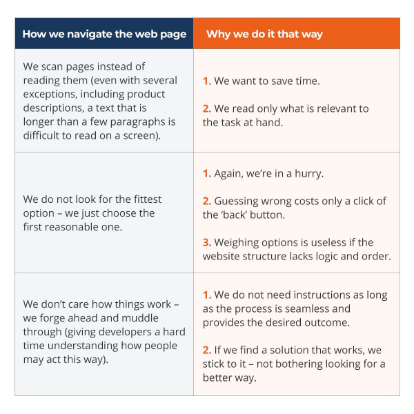
Picturing a super-rational and attentive user who would navigate the website the way we do it, let’s not forget that everyone – including ourselves – tends to consider our behavior much more sensible than it really is. As such, the average web use pattern follows three basic principles:

Whether you accept or not your personal tendency to inconsistent web use, there is a couple of fail-safe features for increasing website usability you should start applying right now:
- A clear visual hierarchy where all the elements are logically and visually nested, while the most important things are also the most prominent;
- Pages are divided into clearly defined areas so the user can immediately decide which parts to skip and which to focus on;
- Clickable parts are easy to identify;
- Less visual noise and page complexity as we all have different tolerance for distractions;
- Appropriate use of the commonly accepted website conventions (after finding the desired item on an online shopping website, we unthinkingly move the cursor to a metaphorical shopping cart, so it would be too risky to replace it with something else even if intended as a design novelty).
E-commerce Usability Testing in a Nutshell
The usability testing is an elaborate process consisting of multiple aspects for those looking for 100% user-friendliness to spruce up their websites. There is no rocket science – just common sense and a few axioms you need to learn first. The most obvious one is that you’ve got to test if you want your website to be great. Testing proves that it is impossible to see things freshly after hours of work, and not everyone thinks the way we do.
What’s more, testing is always a good idea because even the worst test with the wrong user provides valuable insights. However, the earlier you test the better as it means there is still time to apply the findings. And finally, testing is an iterative process, meaning you test features you’ve just added, then fix them, and then test again.
1. Usability Testing Objectives and Key Evaluation Measures
The main usability-related concerns relevant to e-commerce websites are associated with the problem areas in the shopping journey. Therefore, testing objectives cover the following questions: Is it easy to find the product customers need? Is there enough information for them to make an informed purchase decision? What difficulties occur? A precisely set objective would contain a measurable goal to achieve (task completion rate, time, accuracy, etc.), a specific user group, and a context for website use.
The list of key evaluation measures for usability testing includes the following:
- Task completion;
- Time spent on task completion;
- Errors per user / per task;
- Users’ overall feelings about a website throughout the testing process;
- The required effort for task completion measured in the number of mouse clicks and the distance of mouse movements;
- Issue counts;
- The variance between the predefined path to accomplish a task and the one taken by the user.
2. How Many Users to Test
Assuredly, the more users you recruit, the more problems they are likely to find in a single test. However, a team of 3 to 5 users allows carrying out more rounds – discovering issues left unnoticed after the first examination. Besides, you will be able to test and debrief on the same day.
Recruiting people for the test will not cause any problem as long as there is a clear understanding of the target audience for the website. Moreover, if your audience is split between groups with divergent interests, then you need a representative from each group to perform the testing at least once.
3. Usability Testing Task Scenarios
Task scenarios provide context for users to engage with the interface in the form of a real-life situation. For example, a task scenario would be:
You’re in the early development stage of your website. You need a usability testing solution. Go to the QATestLab website and request a call to learn more about their services.
The ideal task scenario is realistic, actionable, and avoids micromanaging users’ every move. Ask them to do the action instead of explaining every step. Thus, if you want the user to sign up for the weekly newsletter, do not phrase it verbatim but opt for “Find a way to receive the company news and sales alerts on your email regularly”.
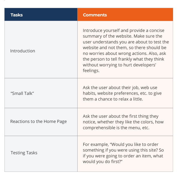
4. A Sample Test Session Plan

5. Typical Problems and Results Interpretation
There are several types of problems that may occur during the testing session. Bringing together too much information usually leads the user into a harmful confusion. In this case, you need to either make the significant links more visible within the overall hierarchy or reduce the visual noise on the page. If the user can’t find the category they need, then probably the content is organized differently from their expectations. Finally, the user might just not get the website concept. Don’t panic. In an average test, it is just as likely the next person will understand everything clearly.
After each testing session, there comes the time for the meeting with the development team to review the finding and decide on the next steps. Using professional terms, you start with the triage (reviewing the problems and choosing the ones requiring to be fixed) and then proceed to the problem-solving (i.e. finding ways to fix them).
Conclusion
Perpetually choosing excellence as a professional approach, any business will be able to leverage the potential of usability testing. Right from the first session, the effort will pay off with important insights for necessary improvements. It is more rewarding than ever and in line with today’s new generation of discerning users. Taking everything mentioned into account, we can summarize: state-of-the-art e-commerce websites owe their success to their content, functionality, and, undoubtedly, usability. So, let's get them tested!
Let Us Help You!
We hope that you found this explanation handy. To get more information about Software Testing & QA, check out our services or chat with us right away!
